PenCarrie, a Devon-based clothing distributor, recently approached Blackdown Signs to design and supply signage for their new multi-million-pound warehouse extension.
With several warehouses already in operation, PenCarrie saw this stand-alone build as an opportunity to set a ‘gold standard’ for their facilities, with plans to implement these improvements across the entire business.
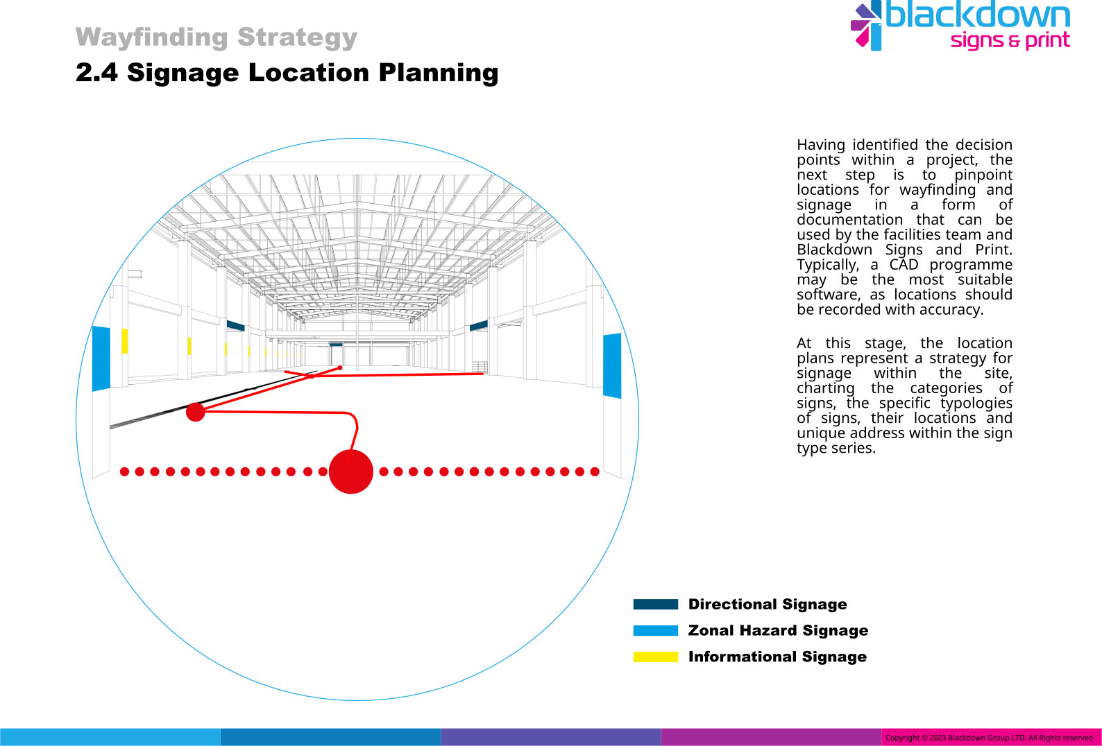
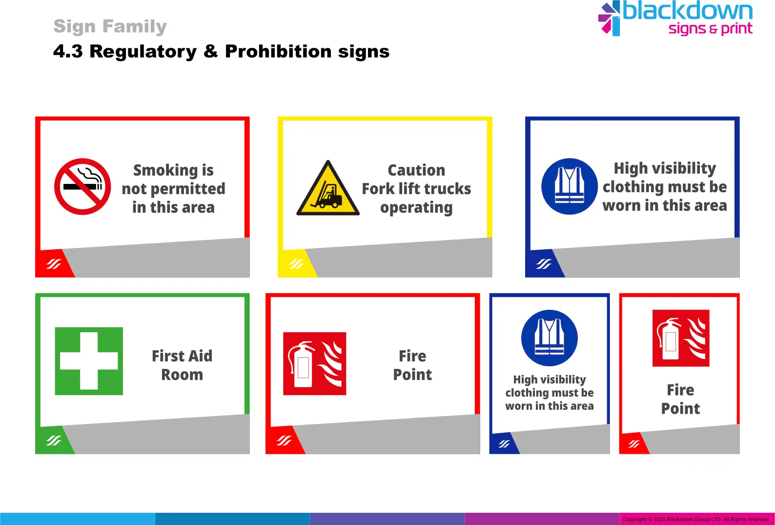
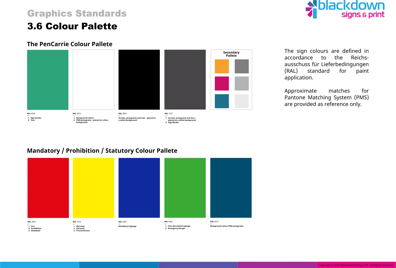
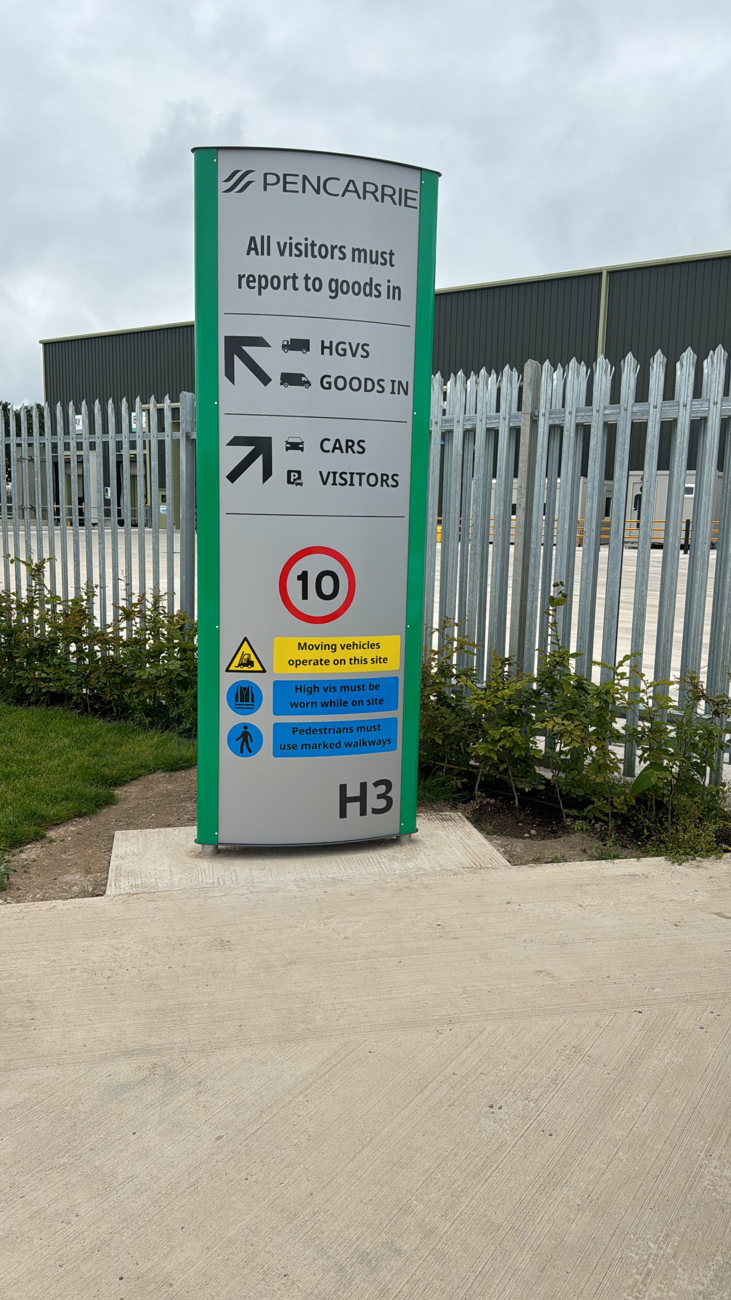
Blackdown Signs began by conducting a comprehensive analysis of the existing wayfinding system, considering staff and visitor movement as well as site conditions. This allowed us to identify key decision points, optimal signage locations, and current pain points in the wayfinding process. A significant challenge in PenCarrie’s other sites was visual clutter, where staff and visitors were overwhelmed by signs and messages without a clear hierarchy or consistency. To enhance the effectiveness and value of the signage, we created distinct categories for wayfinding, visitor, and safety information. We also established guidelines for signage locations, sizes, hierarchy, information grouping, and legibility standards.
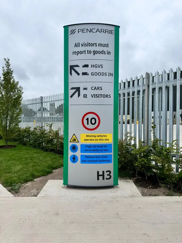
Bold iconography allows key areas to be identified without heavy reliance on english language – key for lorry drivers and visitors for whom english may not be a first language.
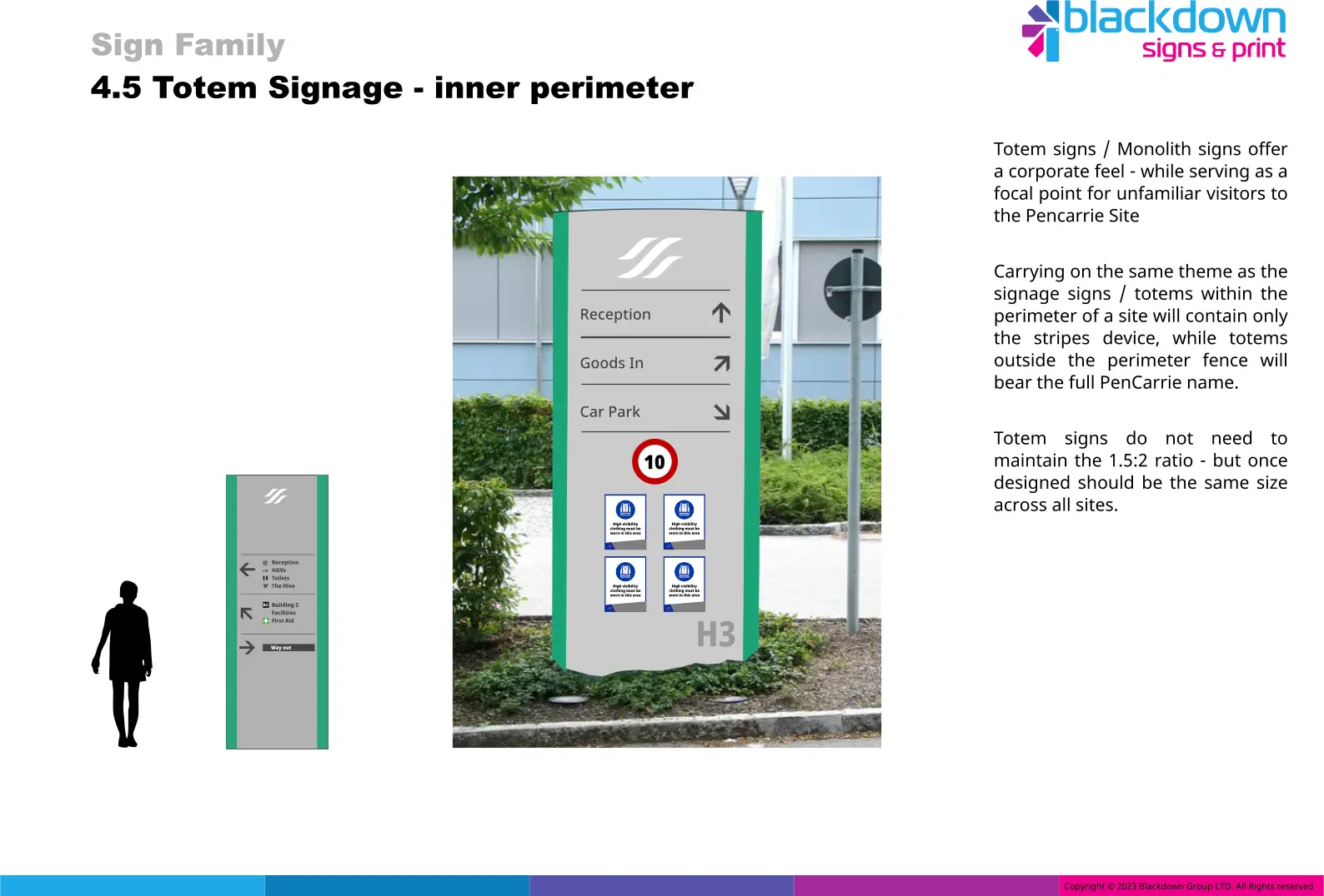
By creating a common brand language across all signage, maintaining a fixed aspect ratio, and utilising a cohesive wayfinding plan across the whole site, signage becomes more powerful, more useful, and more informative, suddenly the signage becomes a powerful site asset – and the feedback from staff and visitors alike has been unanimously positive. – Chris Hewett Facilities manager PenCarrie Ltd
To finalise the wayfinding and signage update for PenCarrie, we undertook a complete redesign of their pictogram suite. This redesign created a unified design language, added new pictograms, updated existing messages, and ensured alignment with the new typeface and overall wayfinding design. The pictograms were meticulously developed to meet international standards while also considering cultural contexts and incorporating modern elements like vaping and gender-neutral restrooms.


